← Back to Store
Ebook
Digital
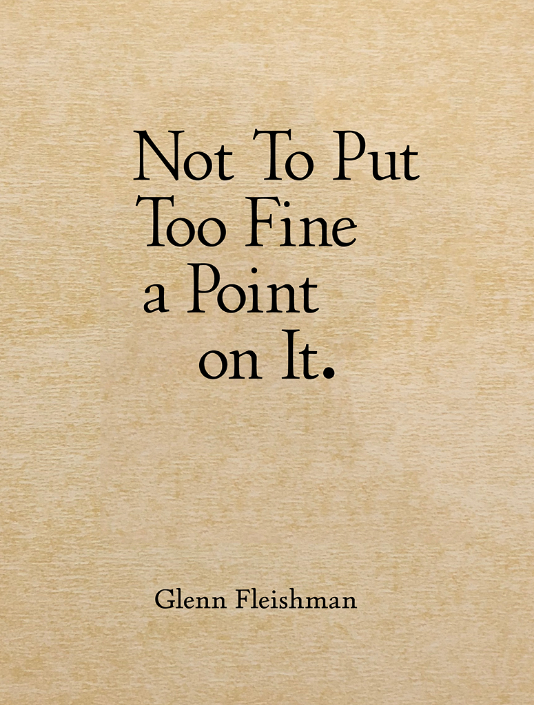
Not To Put Too Fine a Point on It
Why we shout in capitals and how to archive a website for 10,000 years
$15.00
If you’re interested in type, printing, and language and where they intersect, you’ll enjoy this ebook of ten researched and reported articles written in 2016 and 2017.
Details
I look into the origin of CAPITAL LETTERS used for SHOUTING, why we type > to indicate a quoted part of a reply, the resurgence of letterpress through digital assistance, Walt Whitman’s 1888 poem “A Font of Type,” a website archiving itself for 10,000 years, and the surprising origin of “this page intentionally left blank”—and more!
The book’s chapters:
- Nothing Is Lacking: The earliest uses of marking a page as intentionally leaving something out.
- CAPITAL CRIMES: Why we SHOUT with UPPERCASE.
- The Ten-Millennium Safe: A website plans for the far future.
- The Quibble with Online Quotes: Will the Internet kill off curly quotes?
- Look Askew: Slanting type is like stealing sheep.
- Noto Bene: Google builds a massive typeface to represent all the languages of the world.
- You Can’t Quote Me on It! Email and forums ape an ancient textual device in marking quotations.
- A Font of Type: Walt Whitman was a printer, and this poem has deep roots in his background.
- What a Relief: While letterpress seemed destined for the junk heap, it’s making a surprising comeback.
- A Crank Turns a Letterpress: Your author spent hundreds of hours walking a carriage on a press back and forth and thinking about what it meant.
Specifications
- Author / Creator
- Glenn Fleishman
- Publisher
- Aperiodical Publishing Co.
- Publication Date
- November 2017
- Pages
- 116
- Format
- DRM-free PDF, EPUB, and MOBI formats